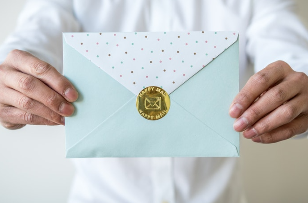
How to capture attention and get the envelope opened
Lessons learned from a cheesy direct mail campaign
74% of Canadian consumers always or sometimes notice advertising in direct mail. So states a recent Canada Post Report. It also found that direct mail gets noticed, opened and read; our brains are hard-wired to pay more attention to it.
The other day I got a really cheesy printed direct mailer in a #7 coin envelope (3.5” x 6.5”). I took one glance at the envelope and was ready to toss it into the blue bin. But I stopped myself. Why? Because I could tell by the feel and the weight of it that it had more than just paper in it. And my marketing curiosity was piqued.
I took a guess at what was inside. I knew it was something with a magnet and figured it was a calendar. I was right.
According to Canada Post, 86% of Canadian consumers open mail that’s personally addressed to them.
I studied the envelope. For starters, it wasn’t addressed. At all. It was a generic envelope – the kind you might find at the dollar story. There was no branding. There was no return address. The envelope was printed in 2-colours – red and green – and read: A “Special Gift For You!”
Integrated direct mail and digital campaigns elicit 39% more attention (time spent) than digital campaigns alone.
Clearly this was a Christmas mailing, yet I received it January 31st. If this was intended to capture my attention it sure worked. The question was, were all of these direct mail “faux-pas” intentional?
Now I was more than curious. Clearly somebody understood the value of direct mail and spent money to provide a tangible reminder of whatever their product or service happened to be. My first thought was that it came from a local printer – or perhaps it was someone selling insurance. I was wrong on both counts. It was from a Real Estate Agent who guarantees he will sell my home – or buy it himself.
Since we just moved into our home 2 months ago, I was once again ready to toss this poorly targeted and poorly timed “gift” into the blue bin. And then I flipped it over.
Once again – it had captured my attention.
On the back of what I now considered a poorly-executed campaign that got lucky, was a printed liquid and dry imperial measures guide. It included all the measurement equivalents for spoons, cups, fluid oz. and grams. Even pinches and dashes! Granted, litres were not represented. But come on! I’m pretty sure that most of my fellow Gen X female home-based business owners would want quick, visible access to this in their kitchen! This was now destined for my fridge.
Yes, the sad little mailing was growing on me and so I dug a bit deeper. Was I a target demographic? Or was this dumb luck? Whatever it was – this cheesy campaign got me to open the envelope – and keep it top of mind.
I dissected the campaign – the genesis for this article – to show you how it tackles 3 elements that lead to direct mail success.
The envelope stood out
Features that make an envelope stand out are its size, its colour and what’s written on it – the more targeted the better. Usually.
Like it or not, this unaddressed mailing nailed it with its ill-timed theme, money-sized shape and generic message. There are literally only 5 words printed on the envelope.
There was something valuable to me inside the envelope
Nobody wants to feel duped. If they’ve taken the time to open the envelope reward them – with things that matter to them. Like a chance to win something, discount codes, digital content, keepsakes – even cheesy magnetic calendars with a handy printed kitchen guide.
I was compelled to act – now … or later
This agent guarantees that he’ll sell my home or buy it himself. That’s a pretty compelling reason for me to act now – except I’m not selling. However – whenever I’m ready, I know I can contact this agent for a free in-home evaluation by either calling him – or through his free quick over-the-net home evaluation.
Final Thoughts
So – was this a well-planned targeted email from a savvy real-estate marketer – or was this just a cheesy campaign that caught my attention? Would YOU have opened the envelope? Share your feedback here – or on your favourite social media platform.
Portions of this article were published with permission in Graphic Arts Magazine.


